Case Study — Product Design
"I believe that young users aged 18-25 will feel in control of their subscription spending if we surface renewal awareness before the charge happens — not as a complex dashboard but as a simple, timely notification system — because my research shows 100% of users currently have no system at all and their pain is always reactive, never proactive."
Product
Subscription App
Market
INDIA
Year
2026
Role
Zero to One
(Product Designer)
Brand
"Know before it goes."

00
OVERVIEW
This is a zero-to-one product design project — from original user research through to a fully branded, production-ready design system. No brief. No client. Just a real problem, real users, and a complete product built to solve it.
THE PROBLEM
Young Indians are losing money to forgotten
subscriptions every month. The money
leaves silently. The awareness comes too
late — always after the charge.
The Solution
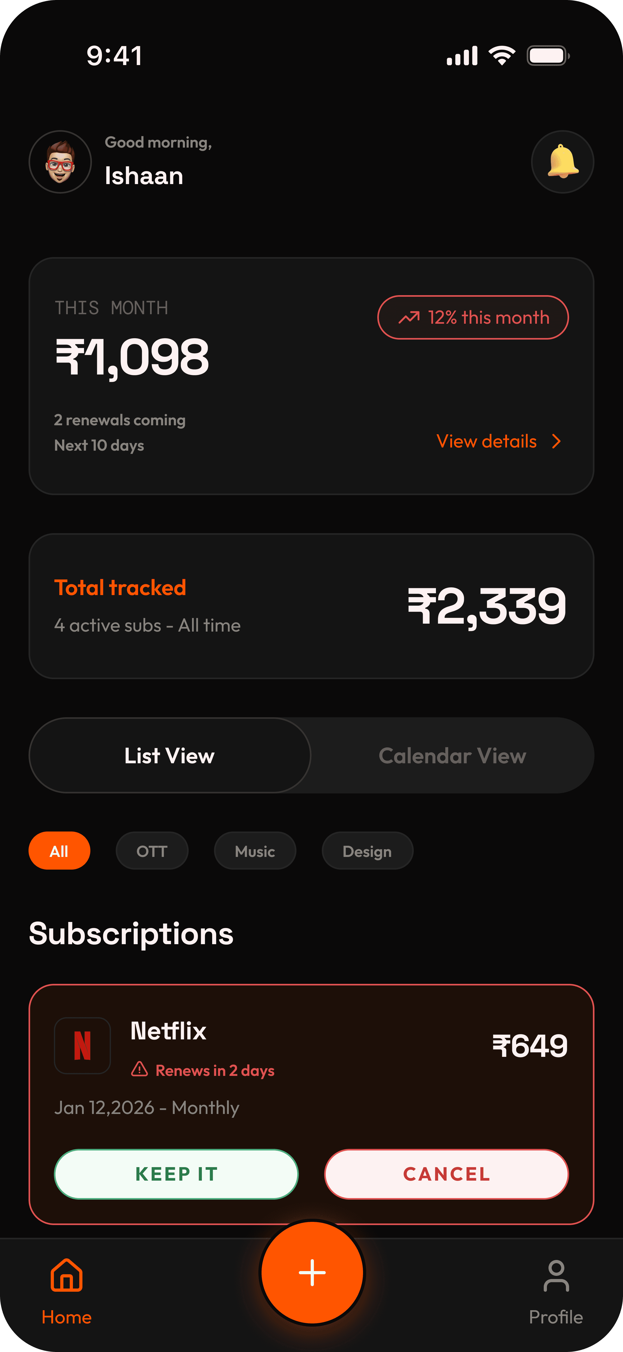
renvu — a lightweight subscription tracker
that alerts you 3 days before any renewal,
requires no bank connection, and lets you
cancel directly if you don't want it.
The Outcome
14 design decisions documented from
research. Full brand identity. Atomic design
system. 24 screens across 7 user flows.
Complete UX writing applied.
Most subscription tracking apps fail at the same point — they are
either too complex and data-hungry for casual users, or too passive
and forgettable after setup. Nobody had built the middle ground.
The opportunity: a lightweight, proactive app that requires no bank
connection, no permanent inbox access, and simply tells you what is
coming before it hits your account.
I ran this project the way a product thinker would — starting from
scratch with real user research, making decisions backed by evidence,
and documenting every choice so any developer could build from the
output.
This is not a redesign. This is an original product, built from a real insight, for a real user.
01
THE PROBLEM
02
RESEARCH
50+
Valid survey
respondents
100%
Had never used a
subscription tracker
1–5
Active subscriptions
per person
0
Had a system to track
their renewals
Key respondents
RESPONDENT — PAVAN
The renewal trigger insight
Pavan mentioned something that changed the entire product direction: he wanted to renew his subscriptions from inside the app, not just track them. This revealed a deeper desire — he didn't want a logbook, he wanted an action hub. It informed the direct cancellation redirect feature.
RESPONDENT — LIAM (LONDON)
The only prior tracker user
Liam was the only person in the survey who had used a subscription tracker. His feedback: "The visualization helped, but the navigation was confusing." This confirmed two things — visualization has value, and existing apps have a complexity problem. Both shaped renvu's design direction.
03
INSIGHTS
INSIGHT 01
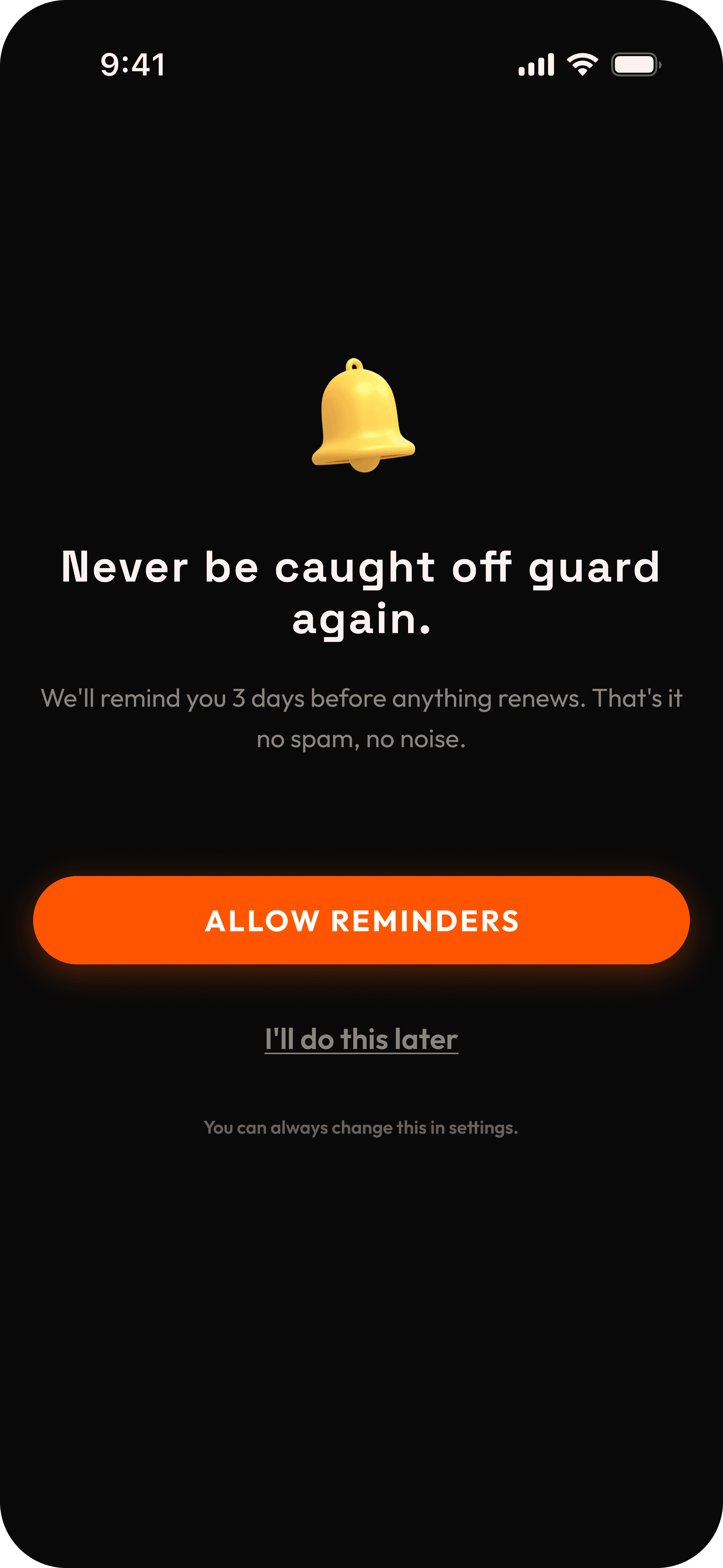
The pain is always reactive
Pain arrives after the bank SMS. Never before. 100% of users described discovering a charge they hadn't anticipated. The product's job is to move that moment of awareness earlier. Not to help people remember — to tell them before they need to.
INSIGHT 02
Privacy is a barrier, not a feature gap
Users did not mention wanting more features. They mentioned not wanting to give bank access. The barrier to adoption is trust, not value. Any product that requires bank credentials will lose the target user at step one — before showing any value.
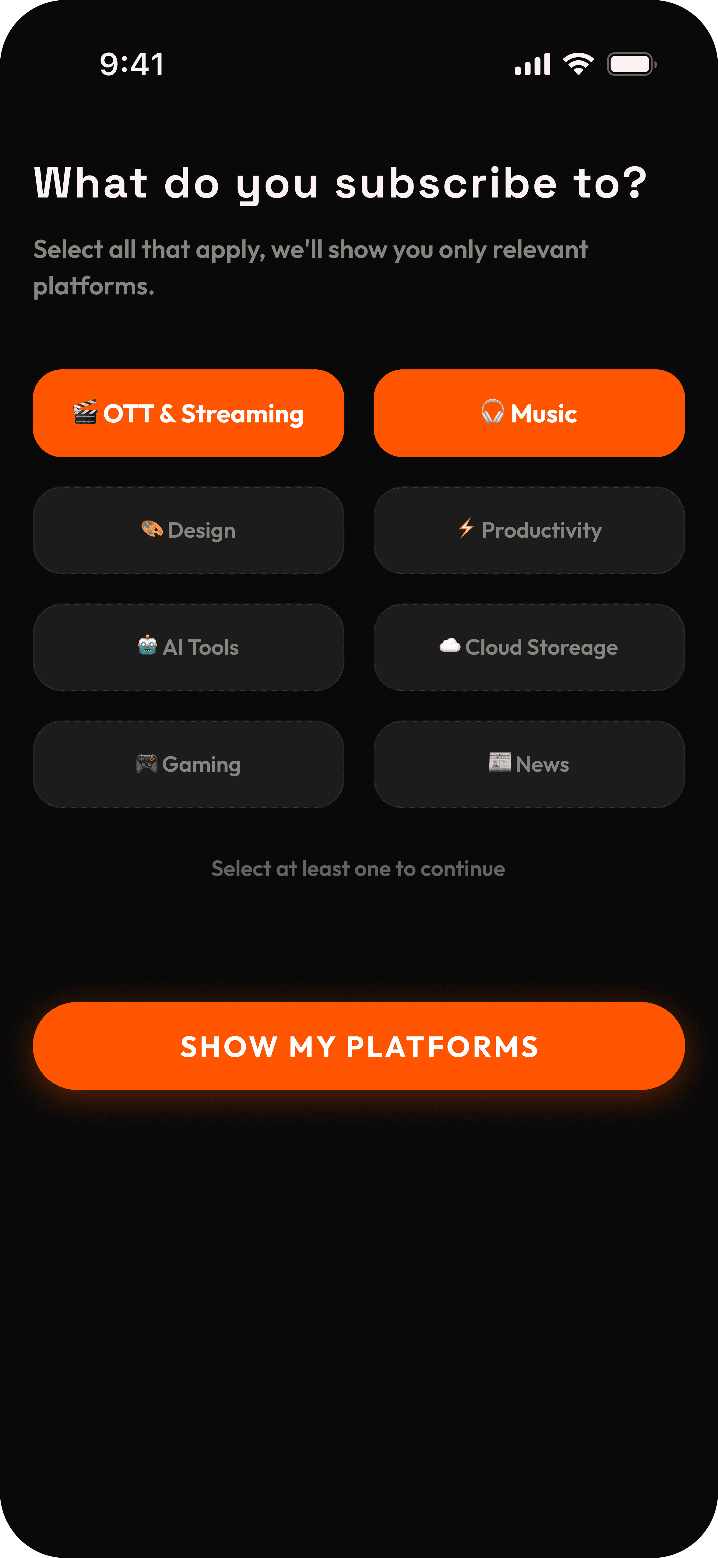
INSIGHT 03
Two distinct user types emerged
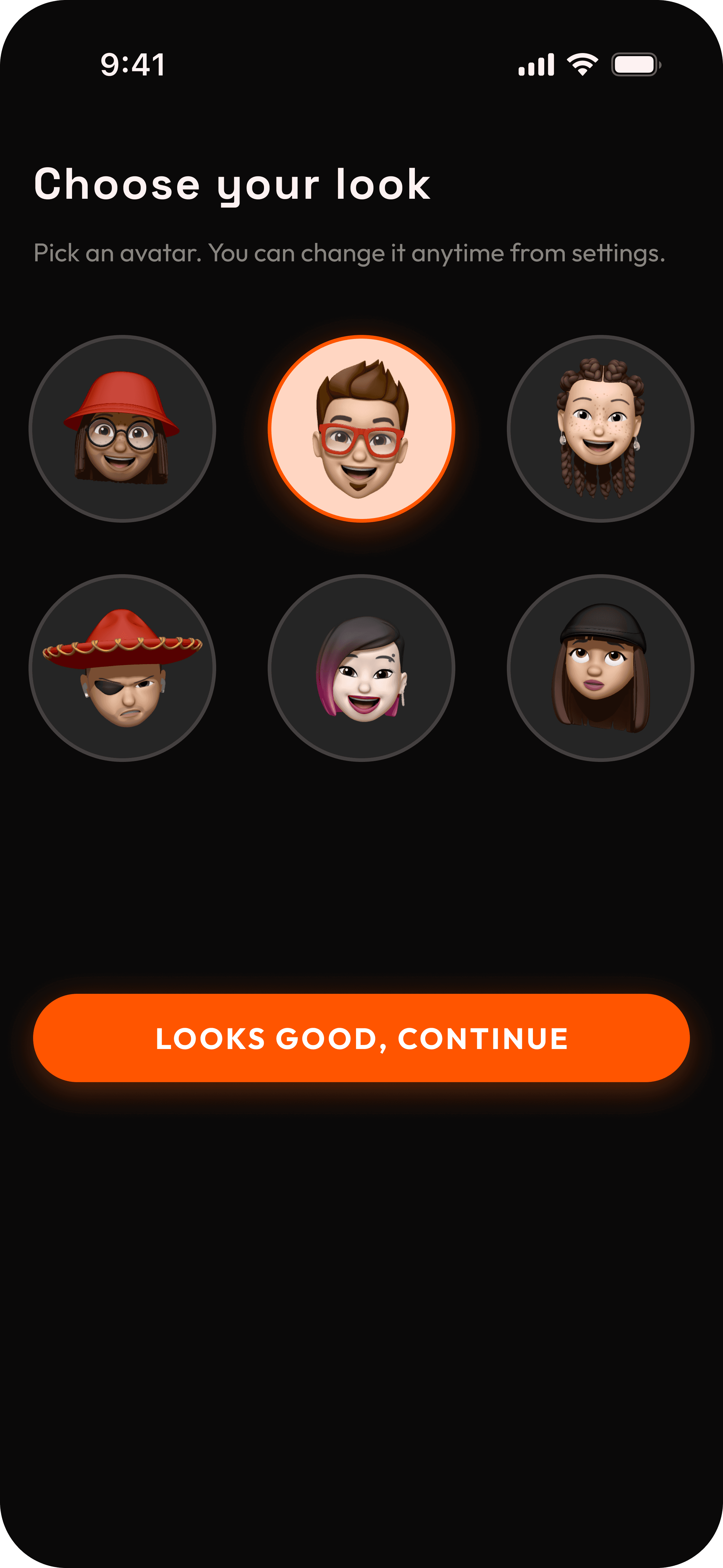
Type A — wants lightweight alerts only. No dashboard, no insights, just "tell me before it hits." Type B — wants full control: spending graphs, history, platform-level detail. Designing for both equally creates a product that works for neither. I chose Type A as primary.
INSIGHT 04
Cancellation friction is real
Multiple respondents admitted staying subscribed to things they didn't use because cancellation was "too much effort." This was not laziness — it was cancellation UX designed to be hard. Direct deep-linking to a platform's cancellation flow became a core feature.
04
USER PERSONA

Ishaan Reddy
19 · Engineering Student · Visakhapatnam
"I paid for Spotify for 2 months after I stopped using it. I only noticed when I checked my bank statement."
Spotify User
OTT Watcher
Design Student
IOS Device
Active Subscriptions
Netflix · Spotify · Figma · iCloud — ₹1,767/month total
Current Tracking Method
Memory. No app, no spreadsheet, no reminder. Just hoping he notices the SMS in time.
The Scenario — "The SMS He Was Not Expecting"
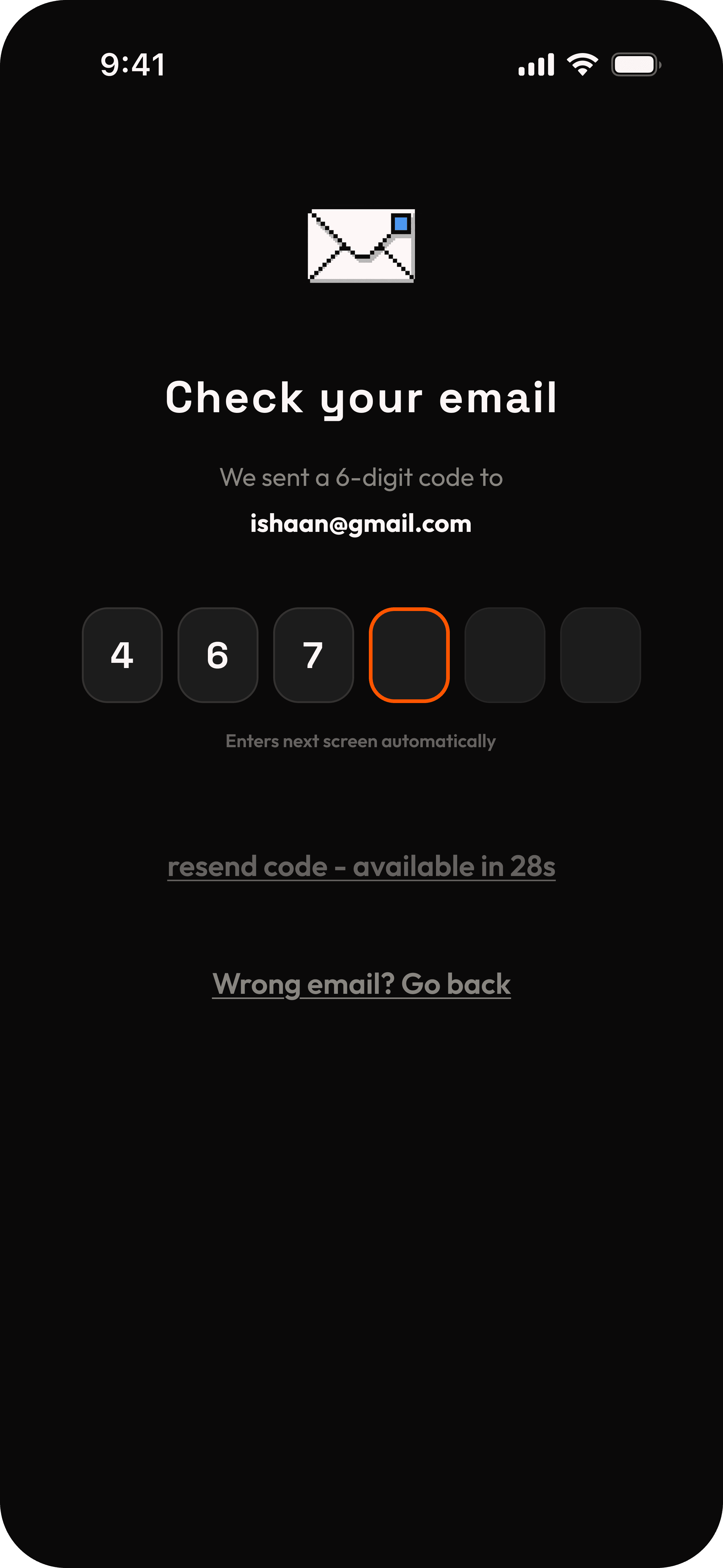
Tuesday, 9:47am. Bank SMS arrives. Spotify renewed — ₹119 deducted. Ishaan realizes he hasn't used it in 6 weeks. The money is gone. The awareness came 5 seconds too late.
What He Actually Needs
Not a dashboard. Not spending analytics. Just: tell me 3 days before anything renews, and let me cancel directly if I don't want it.
05
COMPITITIVE ANALYSIS
Truebill
Comprehensive but demanding.
❌ Forces bank connection upfront
❌ Heavy onboarding process
❌ Complex, overwhelming UI
✔️ Full financial picture
renvu.
Lightweight and proactive.
✔️ No bank connection needed
✔️ No bank connection needed
✔️ Immediate action on renewals
✔️ Simple, focused interface
✔️ Value shown from first use
Subtrack
Zero friction but passive.
❌ No alerts or notifications
❌ No dashboard or insights
❌ No reason to return
✔️ Easy manual entry
06
DEESIGN DESICIONS
3-day alerts
Users react to charges, not calendars. Alerts arrive 3 days before renewal, not same-day.
Zero bank access
Privacy was the top adoption barrier. No bank or card connection required.
Manual entry
Preloaded platform list keeps input fast without touching user data.
Deep-link cancel
One tap opens the platform's own cancellation page. No hunting through settings.
Urgency colors
Color-coded system shows renewal proximity at a glance - red, amber, green.
Lightweight UI
Type A users want speed, not features. Every screen stays minimal and focused.
07
HIFI-SCREENS


08
BRAND IDENTITY


09
UX WRITING
BEFORE → AFTER
"Cancel" → "I want to cancel"
A bare "Cancel" on a destructive action feels abrupt. "I want to cancel" is personal and intentional — Ishaan owns the decision. The difference between a button and a statement.
TRUST COPY
"We don't contact Netflix."
Users fear that confirming a cancellation in the app does something to their Netflix account. It doesn't. Say it explicitly. The best UX writing pre-empts the question Ishaan hasn't asked yet.
10
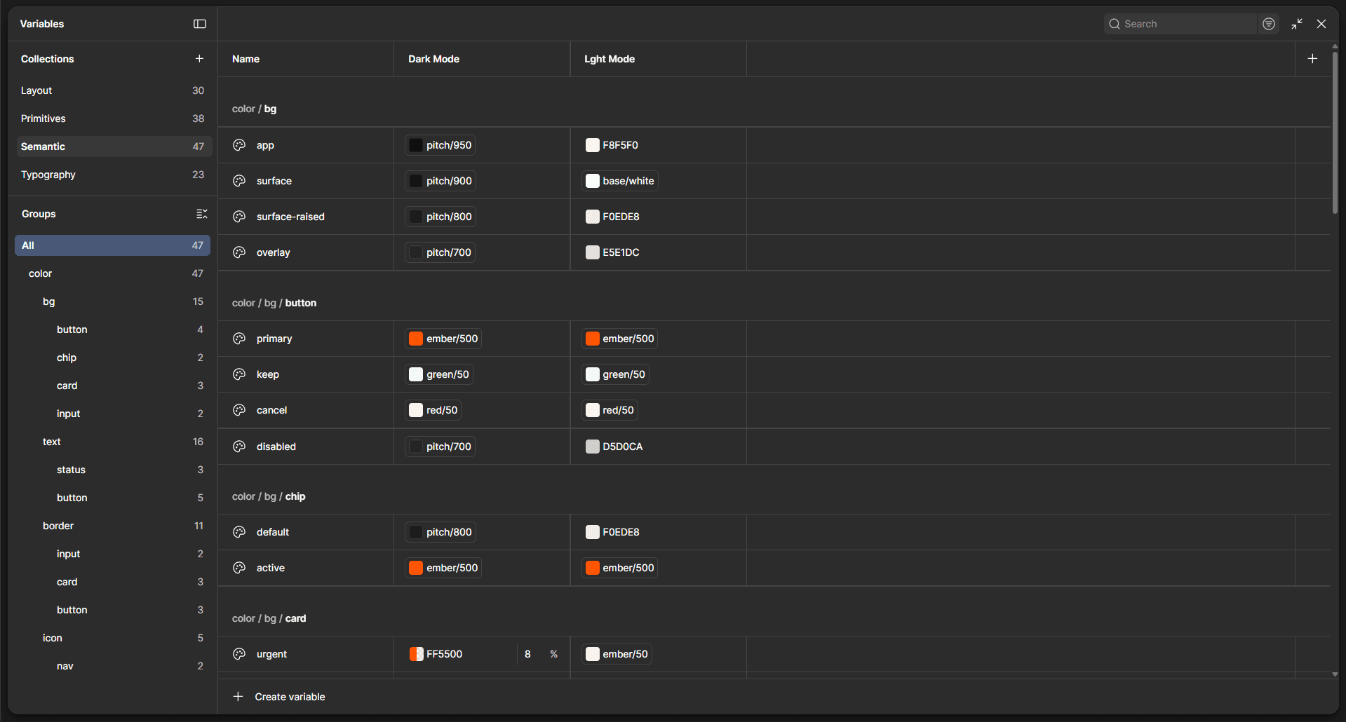
DESIGN SYSTEM
The system is universal — the atomic design framework built for renvu applies to every product that comes after it. Tokens, atoms, molecules, organisms. Change a primitive, everything updates. One source of truth.
12
REFLECTION